Introduction:
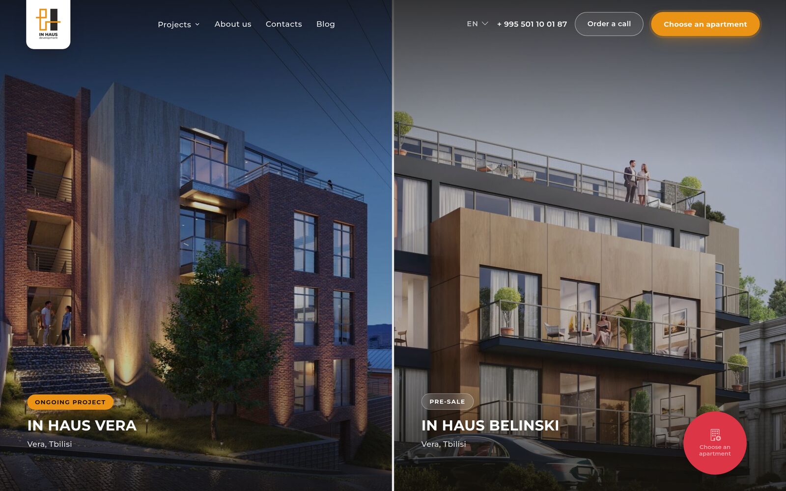
IN HAUS builds boutique houses in Tbilisi — small premium developments. When I took the project on, the company had IN HAUS VERA completed and BELINSKI getting ready to go on sale.
The company had a site and it had stopped coping. It showed the status of the developments in a way that gave away nothing of the premium segment, and the company could not run it themselves — every edit meant going to a programmer.
The task:
I started by taking stock: what gets in the way right now and what should be happening on the site at all. That came together into a brief.
A premium look
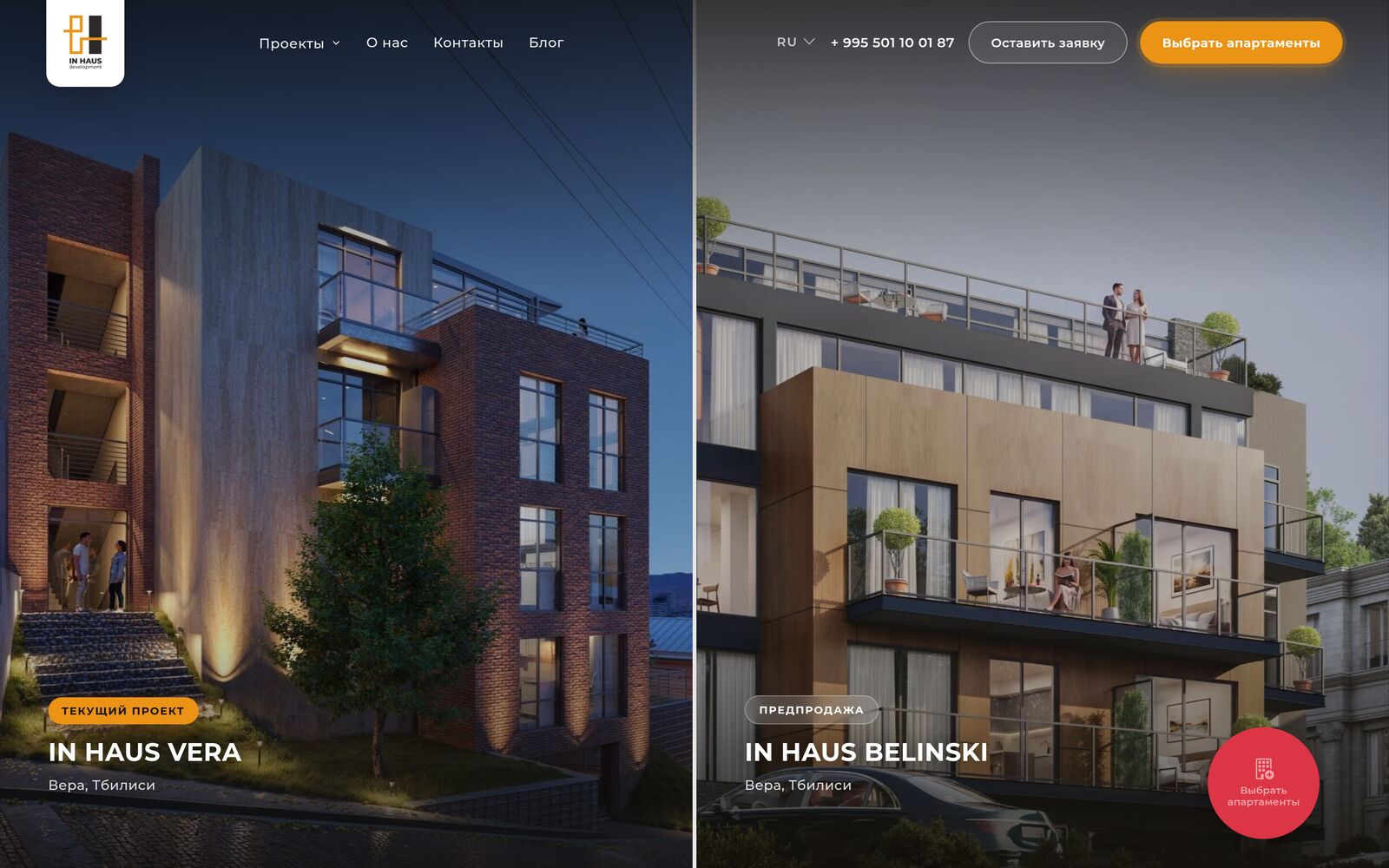
The site had to look expensive — to sell the standing of the developments rather than read like an off-the-shelf template.
Three languages
Work in three languages: English, Russian and Georgian, and Georgian was non-negotiable — that is the local market.
Run from the admin panel
The marketer changes texts, photos, terms and project statuses on their own, with no programmer involved.
Leads into the sales system
Leads land in the sales system straight away and are duplicated to the sales managers in a messenger.
Unit inventory
Show the current unit inventory — the same one the sales team has.
Speed on mobile
Open fast on phones — the audience in Tbilisi is on mobile.
Speed of change
At a property developer the edits never stop — prices, terms, addresses, photos, statuses — and they are needed “today, in time for the meeting”, not in the next sprint.
Three options:
Against it I put forward three scenarios, from the minimal one to the full one:
1
Development pages only
Leave the site as it is and add pages for the residential developments to it. The fastest and cheapest route, but the old site stays old: the new pages would look out of place.
The client's choice
2
Redesign + development pages
A full redesign of the site plus pages for the residential developments. The company gets one coherent modern site, and the developments get a showcase inside it.
3
Redesign + an apartment catalogue of our own
The same again plus an apartment catalogue of its own, built separately around the developer’s needs.
The client chose the second — it covered the task in full. We did not rewrite the apartment search: the developer already had a sales system running, so we connected to that.
How it went:
Design and development ran in parallel — there is no other way to put a site like this together in three weeks.
3 weeks
The whole site was ready in three weeks — design work included.
One layout
The pages of the residential developments were built to a single layout: the project cover, the apartment search, a description of the development, selling points, a gallery and lead forms. Because of that the next project is added without markup of its own — that is how BELINSKI came to the site after VERA.
Everything in fields
All the content was moved into fields: texts, images, terms, badges, figures. The marketer edits the site themselves, and there is no need to touch the markup for it.
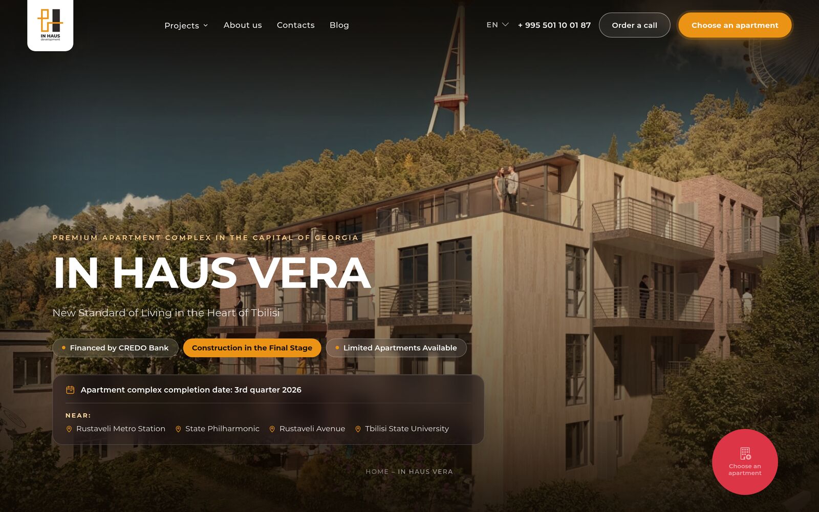
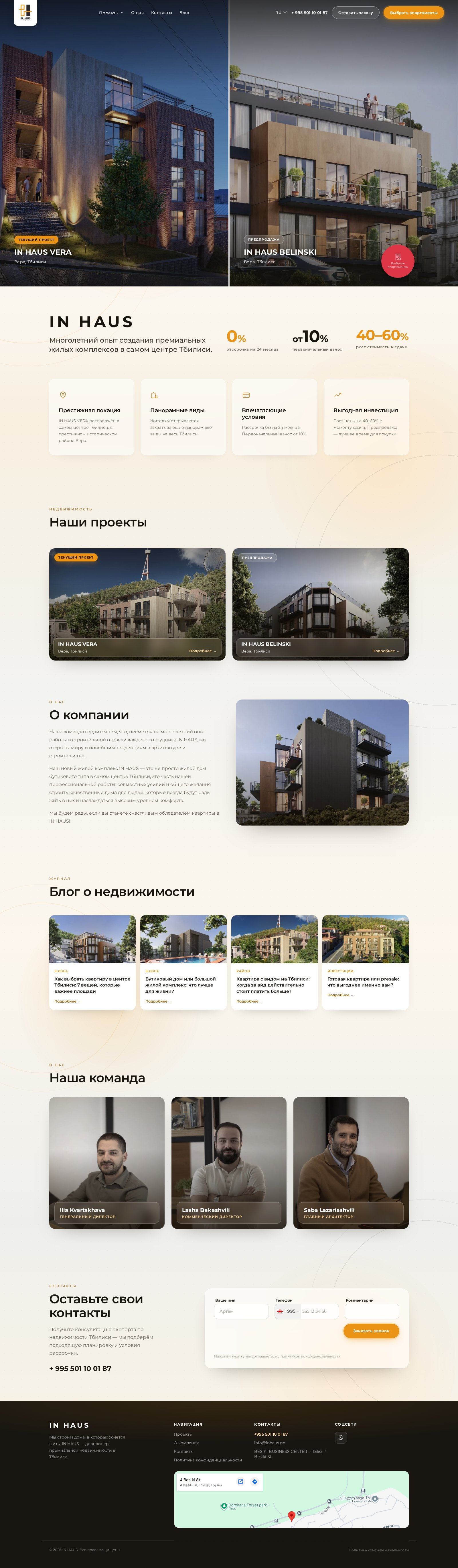
Hover or tap and the site scrolls. ⛶ — open full screen
Three languages:
The three languages here are real, not a switch for show: every page has a version of its own in English, Russian and Georgian — with its own content and its own meta tags for search. Georgian is set in a separate typeface, and I checked the line breaks in narrow columns by hand so the text would not tear the layout apart.
The maps on the pages obey the language too: their labels switch along with the version instead of staying in one language for everyone.
Apartment search:
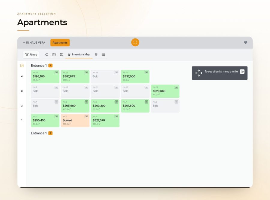
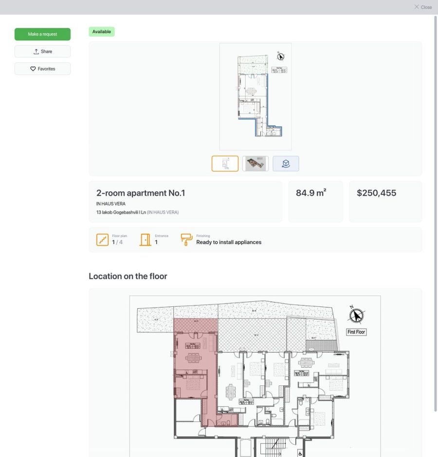
The development pages run an apartment search tied to the developer’s sales system: the unit inventory, prices and statuses on the site are the same ones the sales team has. People search whichever way suits them — by the plan of the block, by parameters or by floor plans — and the unit card shows everything about the apartment and takes the lead from there.
Speed took separate fiddling: heavy third-party scripts do not load with the page, they are pulled in only once someone has scrolled down to them.
Leads:
Leads from the forms go into the sales system and at the same time drop to the sales managers in a messenger — the lead is visible immediately, without opening the CRM. The spam protection loads not on the first screen but when someone starts filling the form in, so that it does not slow the page down.
Along the way I found a break in the pipeline: after the spam check the form submitted by reloading the page, and people could not tell whether the lead had gone through or not. I brought back submission without a reload and added a clear confirmation in all three languages.
My role:
I ran the project end to end: working out the task, the brief, development, integration with the sales system, three languages, launch. After that — support, and it is still going.
Result:
The site came together in three weeks, design included, and runs in three languages. The company keeps it up itself: texts, photos, terms and the status of the developments are changed from the admin panel. Leads reach both the sales system and the sales managers, the search shows live unit inventory, and a new development is added on the ready-made page layout.
From there the project lives on a stream of constant edits: tasks fly in over a messenger, I check them on a copy of the site and launch them into production once they are confirmed — often the same day.
For anyone interested in the IN HAUS site.
Client feedback:

We needed the site fast, and we needed one we would not be embarrassed to show premium developments on. Pavel did the whole thing in three weeks, design included — and landed exactly on what we wanted: expensive-looking and tidy in all three languages, Georgian included.
We have carried on at the same pace since. I send edits straight into a messenger — as text, as photos, sometimes just a screenshot with notes on it — and get back a clear breakdown and a result, often the same day, in time for a meeting. Several times we caught and fixed things I would never have spotted myself, before any client saw them.
Thank you to Pavel for the work — recommended.