Introduction:
The company builds software for property developers. By the time the work started it had no visual identity: no system of marks, no rules for using them, no shared constants for websites, presentations and product interfaces.
I built the identity from scratch and wrote the guidelines for applying it.
What was done:
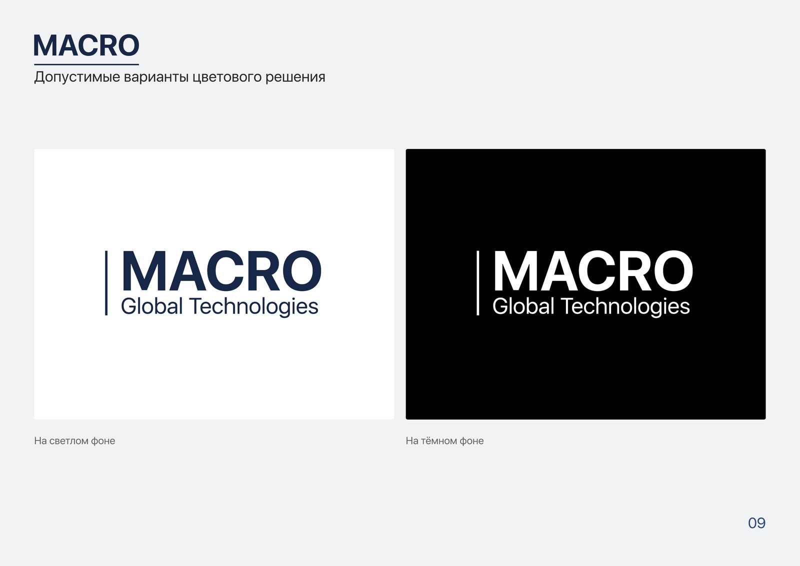
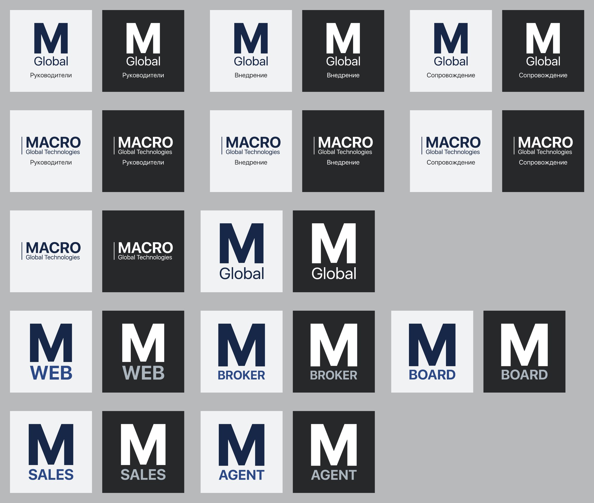
The marks. The primary logo, a monogram for tight spaces, product logos and product badge monograms. A construction scheme was set: a product logo is assembled from the simplified company mark and the product name in the same two-colour palette — a new product gets its mark by the scheme.
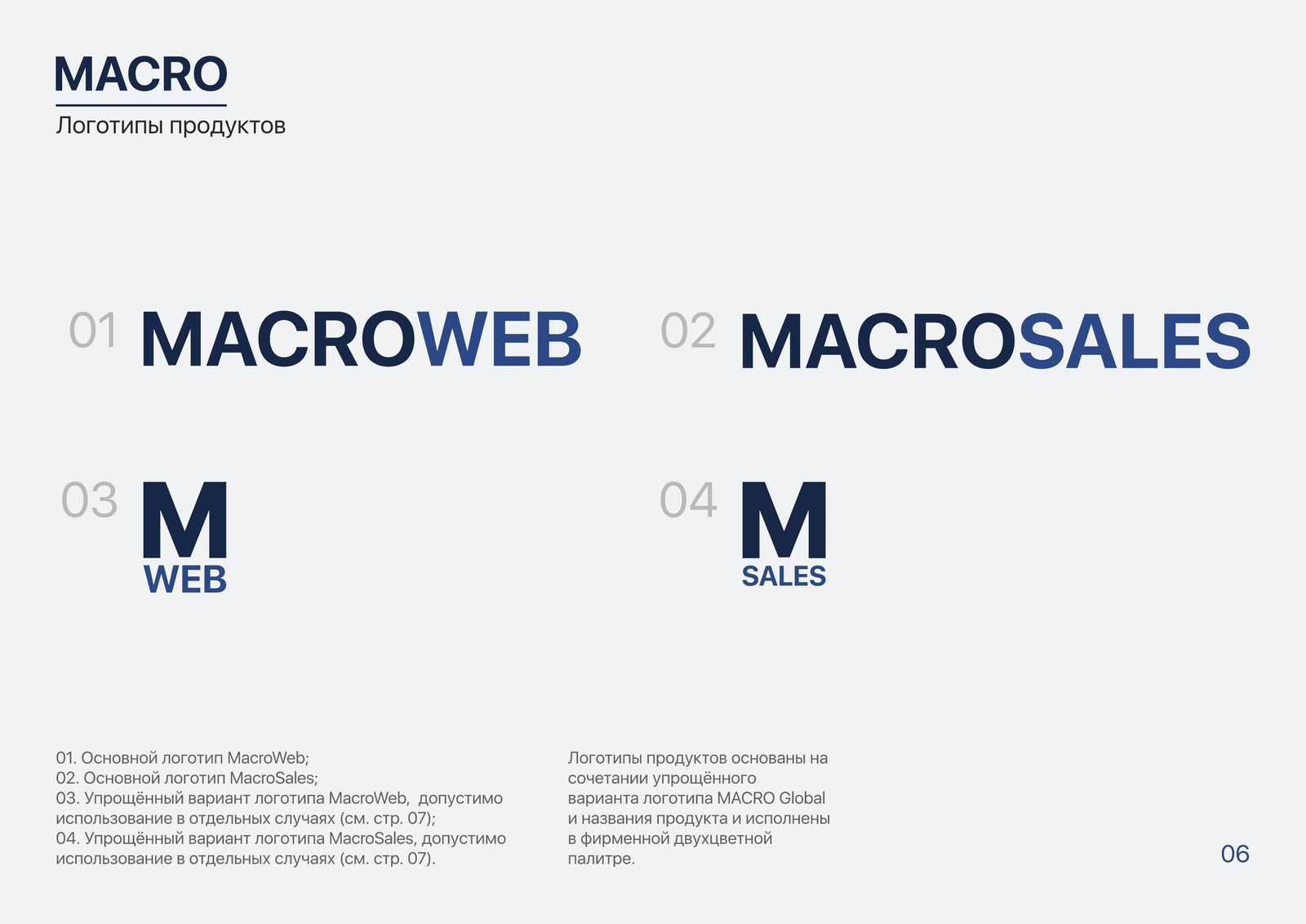
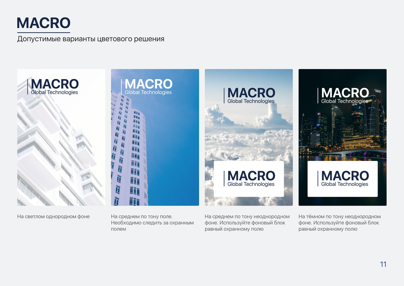


The guidelines — 24 pages, four sections. Logo: the primary version and the permitted variants, clear space, use on light, dark, even and uneven backgrounds, co-branding, what is not allowed.
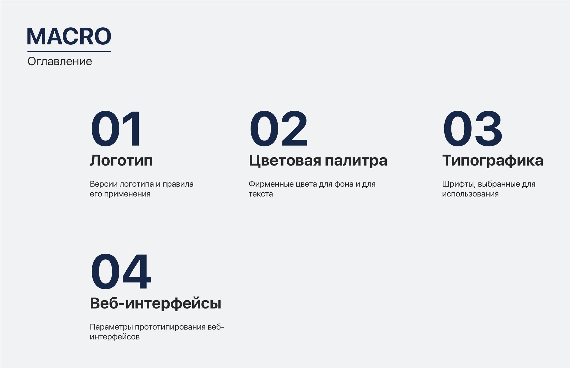
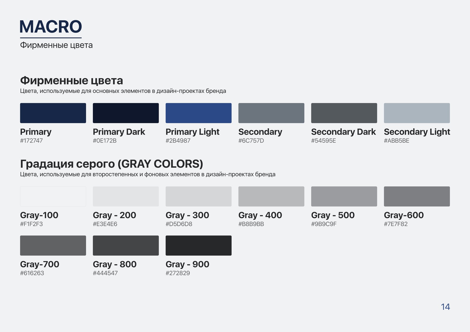
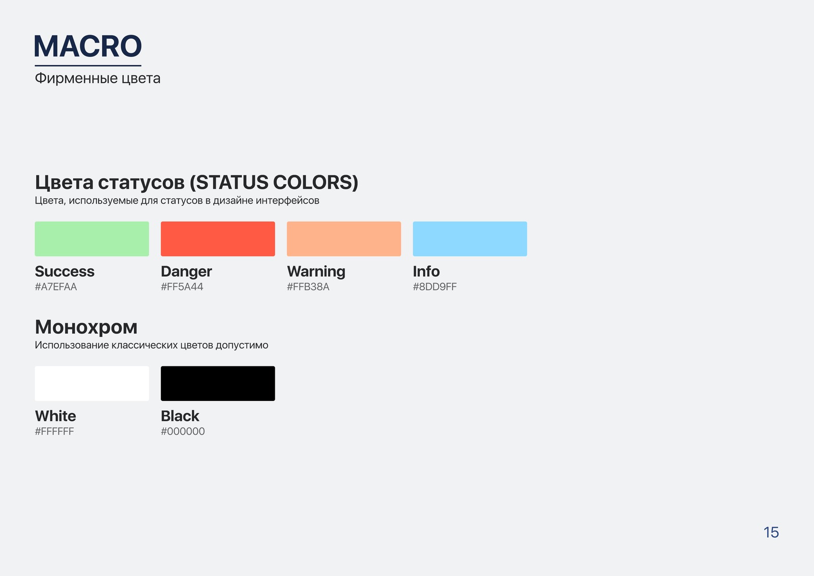
Colour palette. Two brand colours with light and dark variants, a secondary pair, a nine-step grey ramp, four status colours, examples of background and text combinations.
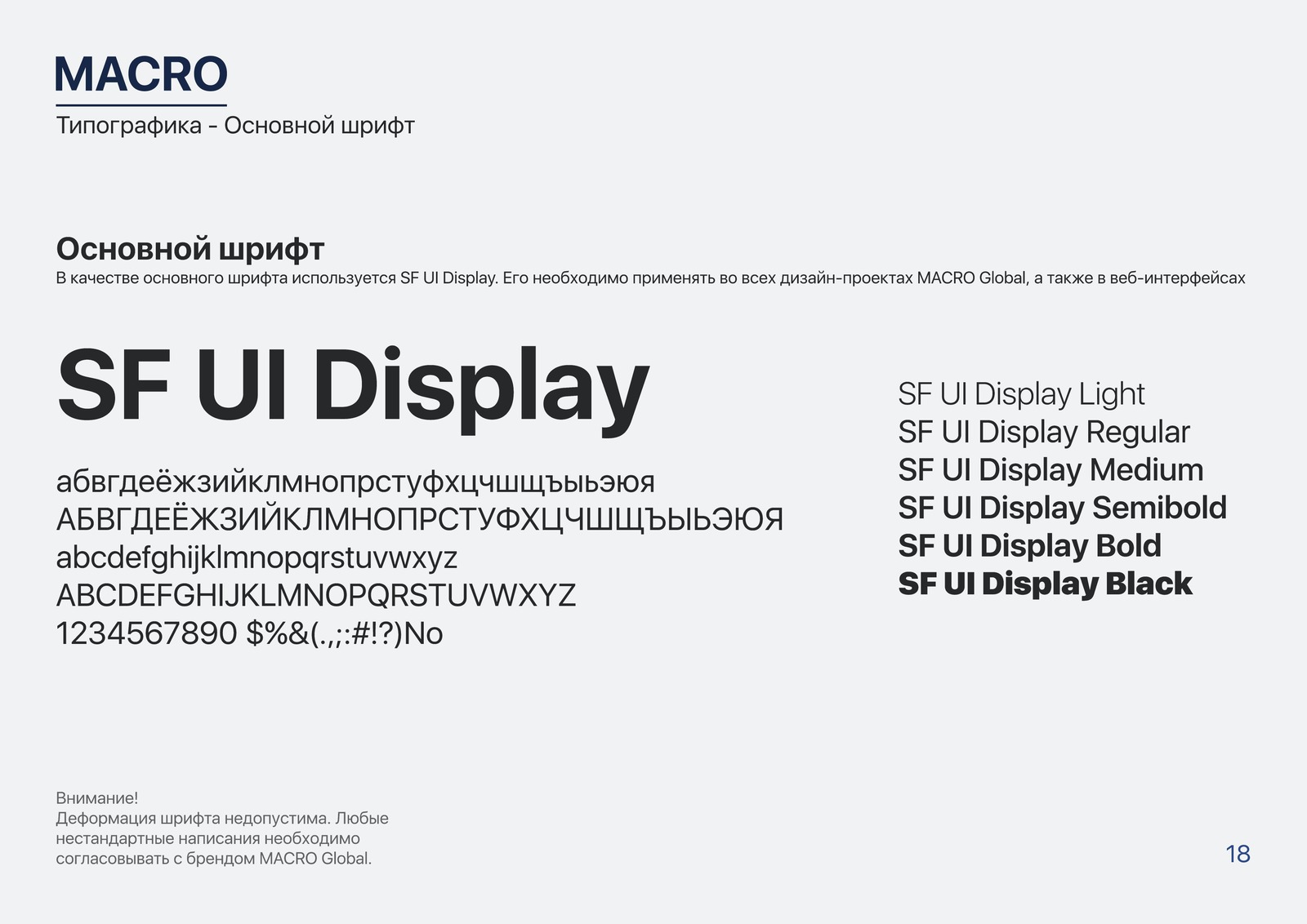
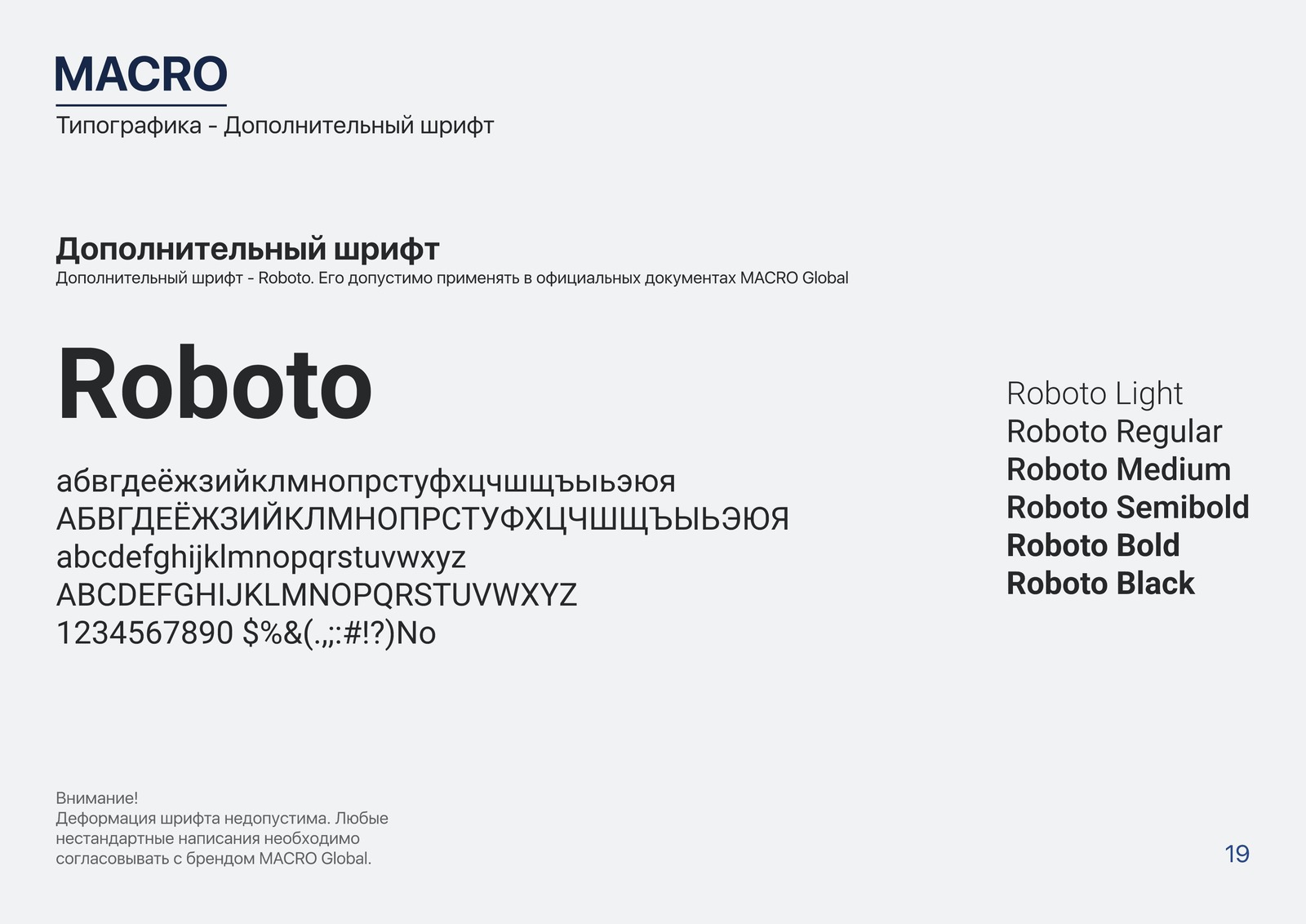
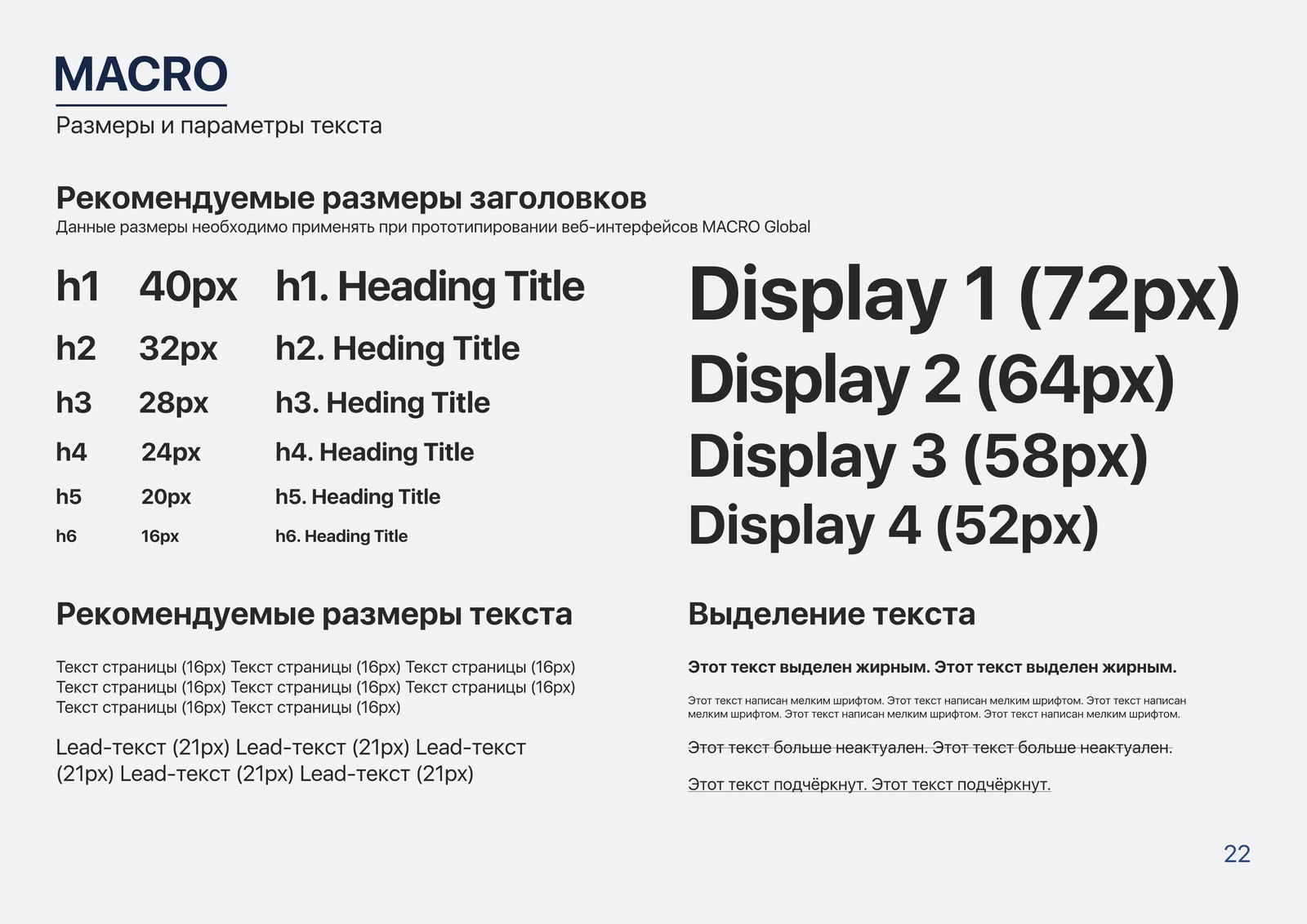
Typography. The primary typeface in six weights, the secondary one, a size table for headings and display styles.
Web interfaces. The spacing grid and the placement of elements, worked through on a landing page mock-up.
Derived assets. Generating marks for new products, covers and avatars for LinkedIn, Telegram icons for every division of the company in a light and a dark variant.
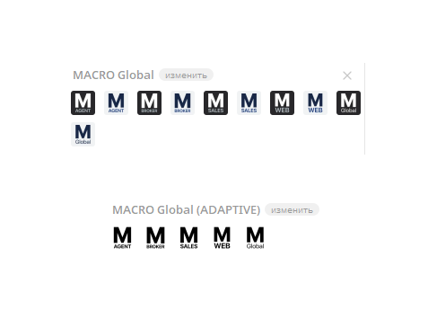
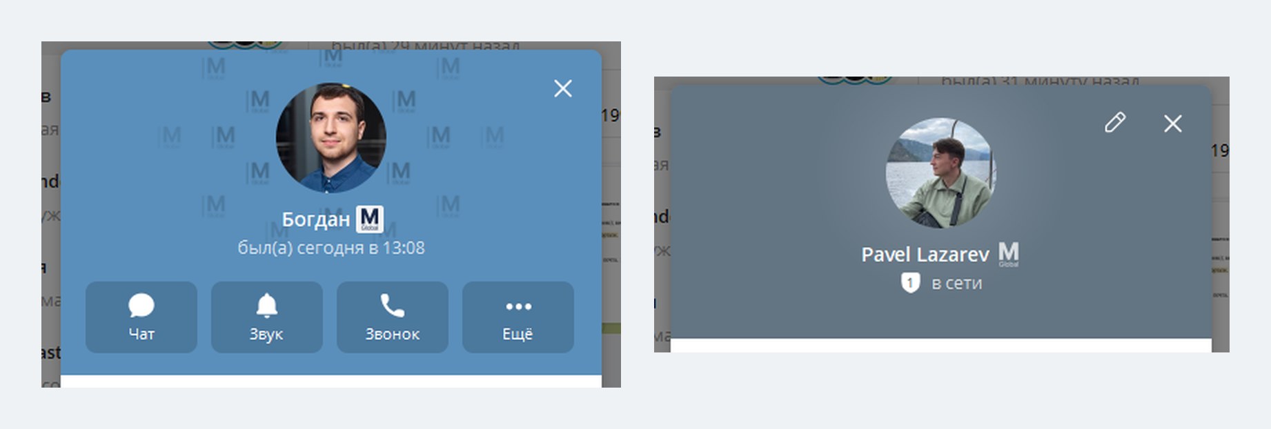
A sticker pack in Telegram. The division marks don’t live only in the guidelines. Out of them I put together sets of emoji statuses for Telegram: a plain one and an adaptive one that adjusts to the other person’s theme. An employee sets the status of their product — and next to the name in a chat you can see who is on which team. The brand ends up where people write to each other every day, without a single banner.
The macroglobal.tech landing page. A hero screen with video, four products with their plans and add-ons, an interactive presence map, feedback, a block of representative offices. Bilingual, with a dark theme. Built on WordPress.
Video. The hero clip for the first screen and a series of clips about the products.
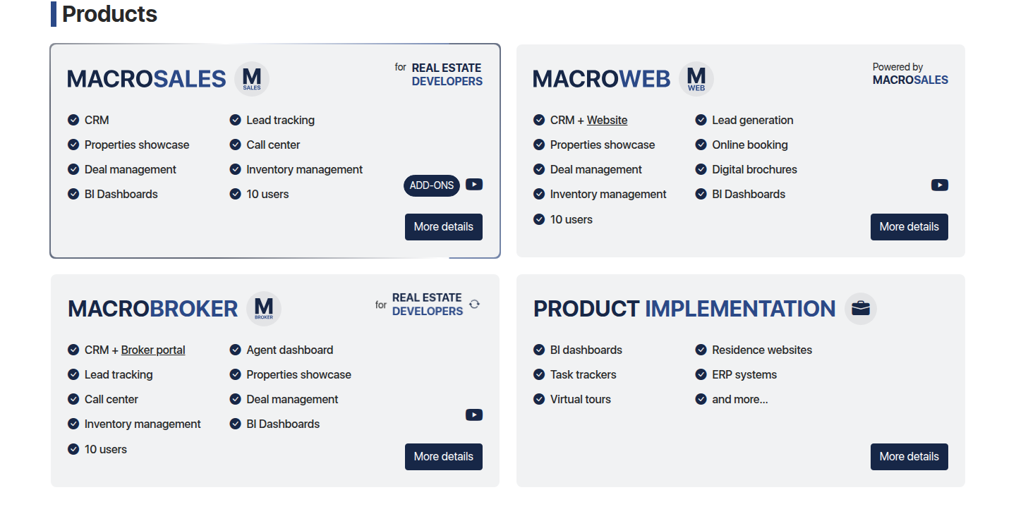
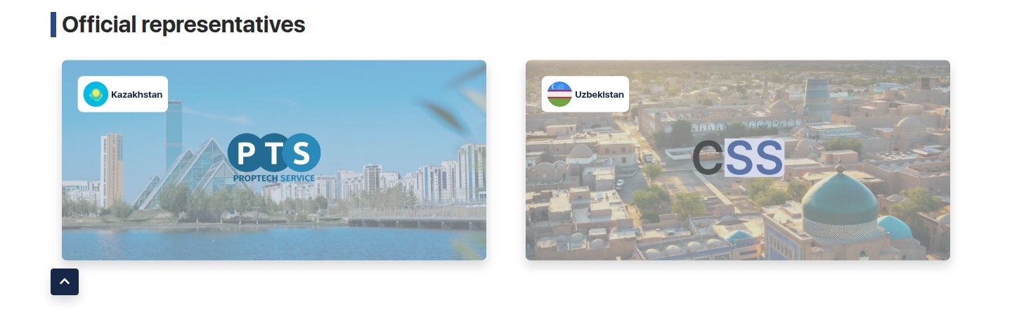
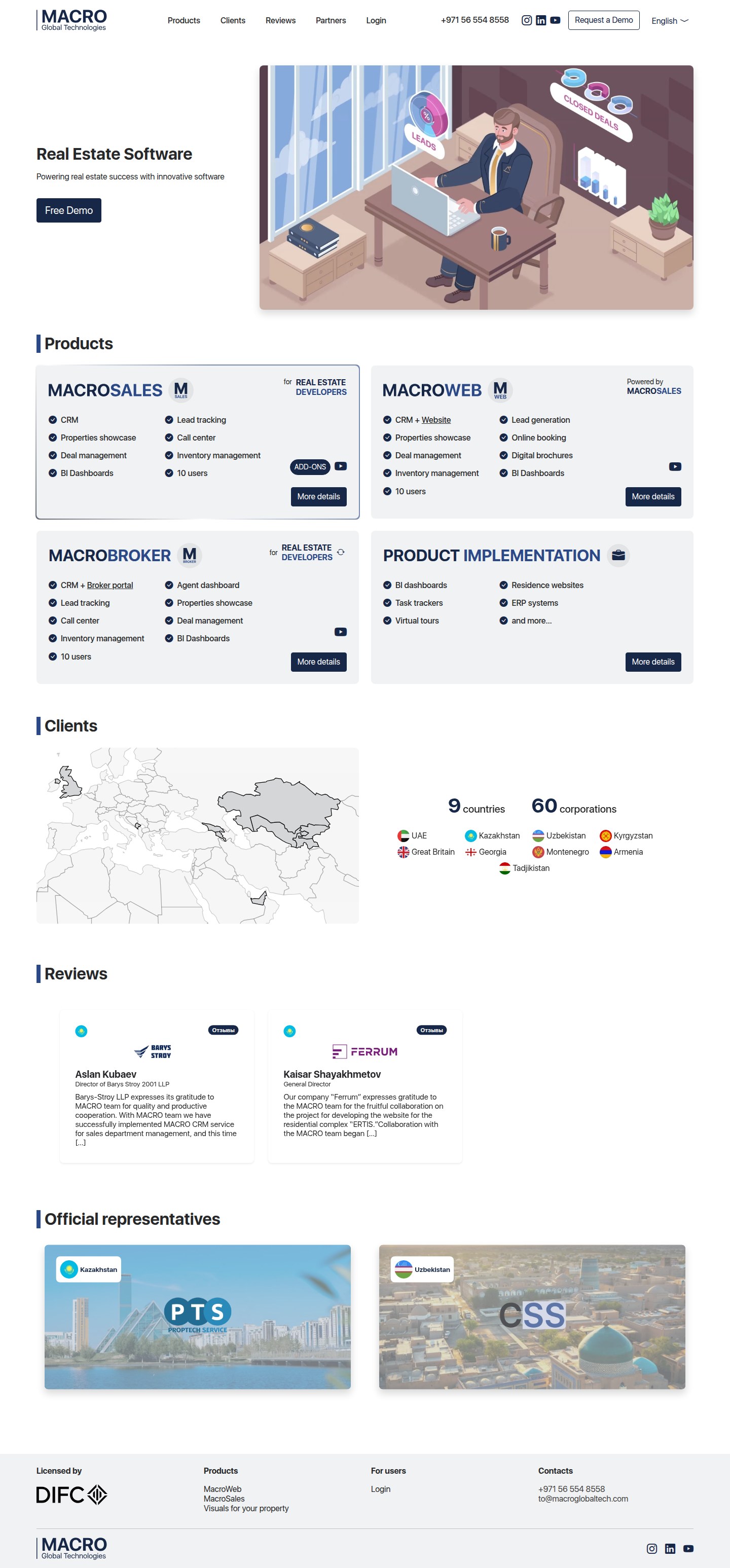
Hover or tap and the site scrolls. ⛶ — open full screen

Hover or tap and the site scrolls. ⛶ — open full screen
Result:
All of the company’s products and around fifty client websites in nine countries are styled by these guidelines.
The guidelines file was last edited in July 2026 — which means it is in use.
My role:
The entire visual identity: marks, palette, typography, rules of use, derived assets. The company’s landing page is my work too.
The company website — macroglobal.tech.